https://vimeo.com/bravodesignince

Bounce Rate + Site Optimization

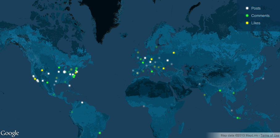
Over the course of the last few weeks, we’ve shifted the focus on the Bravo Design, Inc. blog from a semi-random traffic grab to generating meaningful content for better overall engagement. And outside of gaining a regular following (i.e., growth in repeat visits), a peripheral goal of mine is to decrease our bounce rate as needed and optimize the BDI site for visitors.

“Are bounce rates and exit rates the same thing?” you ask.

No, your bounce rate is the percentage of people who land on a page and leave before navigating to the next. They might be on that page for one second, one minute or one hour, but they’re not going anywhere else before leaving.

The exit rate is defined as the percentage of traffic that leaves your site from a given page based on how many visits that the particular page has received. These visitors have landed on other pages, going from pages X, Y to Z and jumped on the last.

While it may be inferred that high bounce rates are always bad, it’s really just a matter of context. For example, if a user navigates to your site, finds a succinct answer to their question and leaves, that specific page has successfully completed its goal. It becomes a problem when the bounce rate is high at the top of the funnel (e.g., on your homepage or halfway through a paginated article).

“So what does a high bounce rate mean?”

One, you’re acquiring the right kind of traffic, and your pages are doing their job. All is well like in the example listed above. This might be true if your visitors are successfully completing a call-to-action and exiting immediately after.

Two, you’re drawing in the wrong traffic, a segment uninterested in what you have to offer. We publish an article showcasing our featured film release almost every week. And for the longest time, we were receiving tons of traffic for a horror movie called The Apparition. Yes, traffic is cool but much more so when it’s relevant.

Now that might not be the best example given the fact that we do a lot of movie marketing work, and a featured release series is right up our alley. But we know that the visitors who frequent these pages shouldn’t be misconstrued as potential customers interested in custom WordPress development of graphic design work. They want to know more about a movie, and we’re happy to oblige.

Three, there’s a disconnect between what visitors anticipate to find and what they actually see. Not too long ago, I subscribed to Ramit Sethi’s newsletter, “I Will Teach You to Be Rich.” He’s enormously popular; author to a New York Times bestseller; etc., and I was looking for practical ways to save money here and there.

One of the first e-mails I got from him was titled, “Congrats, Your 1-Week MBA on Earning More Money Starts Tomorrow.” Really? In it, Ramit goes on to say that he went from making $20/hour to $3,000 in just a few years, and that might be true. It might not be. I have no idea, but claims that seem too good to be true make me increasingly more apprehensive as do “30-Day Courses on Hustling.” As a result, I didn’t read any of the additional literature sent to me.

This also takes shape in the form of link bait. The people who frequent your site and follow you via social media do so as a vote of confidence. Don’t abuse that.

Four, your website is killing them, Smalls. This might be due to technical bugs, a lack of user-friendliness, poor design, slow load times, etc. It’s impossible to diagnose without actually seeing your site, but we’d be happy to give your site a look if you drop a line in the comment box below with your URL and e-mail address.

“Why does any of this matter?”

Imagine that you’re going out to dinner. You’ve heard raving reviews from everyone and their mom, and you’re amped to finally get the chance to try it out. Only, when you walk into the foyer of the restaurant, you see a giant rat dart across the corridor. What do you do? You probably leave regardless as to what you’ve heard and call the health department before pulling out of the parking lot.

If the homepage of your website is in any way similar, and your prospective clientele exits as soon as they enter, you have a serious problem. Bounce rates provide you with insight as to how your website is performing and will help you determine if landing pages are performing up to standard. Because in the end, vanity metrics like web traffic are pretty meaningless and a huge time suck.

If you’d like some feedback on your website free of charge, leave a comment in the box below with your URL and e-mail address or send us a Tweet with the hashtag feedback (#feedback).

https://vimeo.com/bravodesignince

WordPress

If you own your own business, you need an online presence. That’s non-negotiable.

That doesn’t mean you need a website equipped with every bell and whistle, but your online traffic is likely to find you through organic queries, at least in part. And since search is by and large intent based where users know or have a general idea of what they want, basic information should be made available to streamline matchups with potential customers.

A locksmith might post hours of operation and a telephone number via Google Places; a restaurant its menu for customers to peruse through on Yelp or GrubHub; and a graphic design agency a blog for readers to find tips and tutorials or browse through an amazing portfolio that showcases its incredible work. That’s my one shameless plug for the week.

That’s not to say that a locksmith wouldn’t blog. It’s just that the minimum viable product requirements are different for them than, say, a brain surgeon. Primarily, because you’d want to obtain as much information as possible on surgical candidates who would potentially open up your head versus a seemingly interchangeable supply of locksmiths. For those who disagree with this point, make sure to leave a comment in the section below.

In any case, an excellent option to cover all your bases is a WordPress si

WordPress, Bravo DesignA Live Look at Activity Across WordPress

WordPress

WordPress is an open-source content management system (CMS) that has taken the world by storm. Known primarily for blogging, it has grown to be much more than that. It powers nearly 66 million websites, with 100,000 more popping up each day. Notable users include: E-Bay, The New York Times, TechCrunch, Reuters, Katy Perry, UPS and a wide array of Fortune 500 Companies. Each month, 371 million people view more than 4.1 billion pages on WordPress sites, and the number of posts created is continuing to trend upwards.

Posts on WordPress, Bravo DesignThe Number of Posts WordPress Users Are Publishing

It’s Cost Effective.

Because it’s open-source, it’s free to download and use, making it extremely cost-effective even if you do decide to purchase themes or widgets; whereas coding a custom CMS with similar functionality could cost a boatload. It’s robust and professional looking and one of the best ways to manage your SEO on the cheap.

Yoast is a plugin that let’s you optimize page information along with meta descriptions, using snippet preview functionality to see what it would look like in Google. If you have pages you don’t want indexed by search engine robots, you can hide them per page. And lastly, you can canonize pages, distinguishing originals from derivatives. Best of all, it’s free.

Yoast, Bravo Design II Yoast, “Why You Should Be Using WordPress”

It’s Flexible.

WordPress is extremely flexible and pragmatic. If a specific feature isn’t built-in to a template, there are currently 24,897 plugins available to enhance your site’s functionality making WordPress a serious contender as an e-commerce platform. With active members contributing from around the world, as well as developers for hire, the customization opportunities are endless.

As an FYI, if you’re a developer looking to chat with peers, you can do so via the #WordPress-dev channel on IRC or using #WordPress. If you’re new to the process like myself, sign up at WordPress.org and use the Codex and/or forums to start learning.

It’s Easy to Use.

Prior to working at Bravo Design, Inc., I had zero experience working with CMS no less WordPress, but learning is a piece of cake. Rest assured, you’ll pick it up quickly too. Everything from backend navigation to adding posts, media or tweaking metadata for search engine optimization is really straightforward.

That’s the beauty of WordPress.

This last week, I uploaded my own demo WordPress to tinker around with, marking my third install ever. I’ve done one via WAMP, one through GoDaddy’s easy install and this one onto the Bravo server. While it wasn’t quite done from scratch because I had a pre-configured FTP login, hosting and a tutorial on hand, it was pretty simple. When I say “simple,” I mean a novice could do it and not “simple” as in the way Ikea describes its kitchen installations.

In the coming weeks, we’ll try and upload an easy to use tutorial for those of you who want to install their own WordPress. But for those of you who already have websites, what CMS do you use and why?

Photo Credit: WordPress.org, Webdesign.org

https://vimeo.com/bravodesignince

Content versus Design

Design, it’s totally and completely inescapable and impossible to overlook.

In publishing eras past, it was an afterthought. Content was first and foremost and appearance a secondary or tertiary concern. If you’re shaking your head thinking, “Content is still king,” I’ll touch on that in a moment. But over the course of the last century or so, there’s been a shift in focus between the two, and that much is evident in the changes we’ve seen with newspapers, and how front page formatting has evolved over time. There are a lot of reasons as to why this his happened, but I’d like to focus on how reader demographics have changed, as have their reading habits, without oversimplifying everything else. Because we consume information significantly differently than we did five, ten and fifteen years ago, organization has been changed to facilitate and streamline that process. The slideshow below shows how The Los Angeles Times has changed since its first edition from a paper crammed to the brim with information to something more cogent and palpable for readers.


“The Los Angeles Times” Headlines from Bravo Design, Inc.

Online, a website’s design is just as important as its content, if not more so, and can be the difference between a visit and a pass or a qualified lead versus an unacceptable bounce rate. To be clear, when I say web design, I’m not just referring to its aesthetics. I also mean its usability. Yes, content will drive traffic and have visitors coming back for repeat visits, but most guests won’t stick around initially if your page is difficult to navigate through or you’ve used GeoCities to build your business page. That’s not actually possible since the service is defunct. And yes, there are always exceptions to the rule, but you know what I’m getting at. There’s a direct correlation in increased conversion with a well crafted website, even if it has its shortcomings, and subpar metrics with one that’s poorly designed. This tidbit of advice isn’t esoteric. It’s money in the bank with real world application.

So what do you do? You build better. Sure, you can use your site but can your guests? If you paused for even the smallest of moments before answering that question, listed below are web design considerations you should mull over.

First and foremost, consider your goal(s). I can’t stress this point enough. What do you want from your website? Are you looking to increase readership for your fratire blog or are you selling <insert anything> or just schooling the general public on your service offerings? In Alice in Wonderland, there’s an exchange between Alice and the Cheshire Cat that’s paraphrased: “If you don’t know where you’re going, any road will get you there.” The quote is all-applicable to life, love and, most of all, your website. Figure it out and then plan accordingly, then plan some more and then execute.

Who’s going to be using your site and how will they be using it? Web content and print content are totally and entirely not the same, so you’re going to have to tailor your writing style to the demographic you’re targeting with their browsing habits in mind. Remember, no one (including marketers) likes marketese so try not to write that way. Next, ask yourself if you’re being engaging? Good design and substantial content will draw users in, which makes them want to connect with you. Without personality, your visitors aren’t going to feel compelled to stay, and this can be detrimental to your conversion rates in the long run.

Manage attention and try to not squander user patience. Two points to think about are lowering barriers to pave the path of least resistance and not providing too many options. The less action that’s required for a visitor to access your site, the better. First-time users who want to read an article or peruse through your site probably aren’t going to want to fill out contact forms or register accounts, and are apt to bounce when confronted with the like, so don’t make them do that. Second, if you’re offering way too many choices, your average user is going to have a difficult time making up their mind. That’s the difference between going to a restaurant that has what seems like an endless menu with samplings from each and every continent and going to one that serves three different kinds of hot dogs.

Last but not least, simplify. This point, though seemingly intuitive, is often the hardest to apply. The best designs speak for themselves, and as Dieter Rams said once upon a time are “as little as possible.” With minimal or no instruction, a child should be able to use it. You don’t have to reinvent the wheel here. You just need to focus on the essential while pruning away everything else.

If you’re still shaking your head, when it comes to content versus design, I’ll cede that they’re equally important, but that’s all. You can leave a comment below if you fervently disagree. If you’re thinking about shopping around for web development assistance, we have a write up listed in our design blog, which might help out in your search. When I initially wrote the entry, I forgot to include that the expert you hire should be SEO savvy, but you already know that. Just remember that the best designers are translators who can turn a vision into something tangible and that our portfolio is also pretty groovy.

If you’d like to download this entry in Word format, click here: Content versus Design.

Photo Credit: Tactile Design Group


https://vimeo.com/bravodesignince

Web Design Update

We were contacted by FASteambanners to redesign their website with a Flex application offering that would allow customers to design their own sports team banners.

Bravo Design, Inc. custom developed a Magento e-commerce based site as our Flash/Flex development network partners concurrently created the “Design Your Own Banner” application. We also developed several custom functions and a custom shipping “Time in Transit Estimator” that was integrated with the UPS API, which allowed the client to manually update their ship-out dates by product type.

The main project goal was to allow FASteambanners to have a more robust web presence and to be able to compete with the other banner printing companies that were rolling out their own custom banner builders.  While several of their competitors appeared to use clipart packages, FASteambanners was illustrating each piece of clipart with the same quality that allowed their airbrush business to thrive.

During the project, the client was informed that their current hosting company would no longer be supporting several of the PHP4 scripts, designed 12 years prior, that ran the website.  As a result, our web development team worked strenuously to complete the project in time for the fall sports season, a very busy time for FASteambanners which would average up to 45 custom banner orders a day.

The website launched successfully, and our client is ecstatic that their products are now being listed, on average, a good 30-50 positions higher on Google’s respective search results.

To see more of our web design work, click here.

https://vimeo.com/bravodesignince

Why You Have One Less Reason to Use Google+

When “Search Plus Your World,” the feature that ranked Google+ content at the forefront of search engine report pages (SERPs) was initially unveiled in January 2012, Amit Singhal, head of Google’s core ranking team wrote, “Search is pretty amazing at finding that one needle in a haystack of billions of web pages, images, videos, news and much more. But clearly, that isn’t enough. You should also be able to find your own stuff on the web, the people you know and things they’ve shared with you, as well as the people you don’t know but might want to… all from one search box… We’re transforming Google into a search engine that understands not only content, but also people and relationships” much to the ire of its competing social media networks (e.g., Twitter, Facebook, Myspace, etc.).

Social graphs, a term popularized by Facebook to describe its social network and, essentially, the global mapping of everybody and how they’re related, have worked their way into ranking algorithms having been designated as an attribute based on trust and authority. And though it was expected that G+ would eventually garner more momentum, which would be reflected more heavily in SERPs, Google has announced that results would no longer be prioritized at the expense of the aforementioned rival social networks. This last Sunday, Singhal told Emma Barnett, a technology and digital media correspondent for The Telegraph, that the company had found a “better place” for results linked to G+. In defense of “Search Plus Your World,” Singhal went on to say, “I think it’s a learning process – even for us. We experiment, we learn, we improve – that’s what Google does.”

What happens now is anyone’s guess. It might be safe to say, at least for the time being, that if you had few reasons to use G+ prior to this update, you have even fewer now.

https://vimeo.com/bravodesignince

A Bravo Design, Inc. Update

Bravo Design, Inc. is proud to announce that it has completed development and launched websites for three of our clients in the last week.

Bootsy Bellows was the first to go up. It’s a nightclub owned and run by actor David Arquette and members of h.wood group, Darren Dzienciol, John Terzian and Brian Toll. Located on Sunset Boulevard in West Hollywood, the club has made a huge splash in the short time it’s been open boasting celebrity guests like Robert Pattinson, Katy Perry, Justin Bieber, his girlfriend, Selena Gomez and many more.

The second was for The Son of an Afghan Farmer, a film written and directed by Matthew Levin. The movie follows Muhad, a student from Afghanistan who comes to college in California but is recalled back prematurely, and the changes he undergoes trying to live and thrive in between those two very separate worlds.

Finally, the website of Los Angeles based director / cinematographer Mark A. Ritchie was given a redesign. Mark favors simple, clean designs and took a minimalist approach to his website. The site exists to showcase his excellent work, and he doesn’t want any other design elements interfering with it.

Our regular visitors might notice that we redesigned our site. Love it? Hate it? Let us know in the comment section below.

To see more of our work, click here.

https://vimeo.com/bravodesignince

Actionable Metrics vs. Vanity Metrics

Throughout advertising’s history, drawing a line from a traditional asset to a sale has been notoriously difficult, but the Internet changed that. Early on, it offered a distinct advantage over its older, offline predecessors: measurability. But despite the enormous progress made, measurement is still one of the major challenges facing both the industry and business owners. Unfortunately, the majority of data made readily available by analytics packages are vanity metrics that scrutinize at a superficial level. They’re useful in the right context and will tell you if your site is engaging or not and how visitors interact with it. But vanity metrics don’t necessarily correlate to more important numbers like cost of new customers acquisition, lifetime value, revenues and profits nor do they affect overall marketing or business goals. Vanity metrics are only focused on because they look great in press releases. The analytics that entrepreneurs should be more concerned with are actionable metrics that help them make decisions.

Think about your most recent website traffic report. What have you done with that? Do you know what drove those visitors to your page? Do you know what actions to take next or how to leverage that traffic? A business that only cares about its daily hit count is the same as a store that only cares about the number of people who come through its doors but not necessarily that they purchase anything. Generally speaking, marketers and advertisers tend to believe that whatever they were working on that immediately precedes a spike in traffic (i.e., new products, promotions or policy) probably caused it. We infer causation from correlation. We aren’t, however, quick to jump on the sword when the numbers go back down. The reality is that a response to a marketing program may often be the result of the cumulative effects of an entire campaign rather than a response to a single advertisement or promotion.

Moving forward, goals should be reoriented not just to validate that you’ve built something people want but also to confirm that your efforts to grow your business are fruitful and paying dividends. This is where you establish and define your product’s unique value proposition. So what should you be focus on instead? Listed below are ways to finding metrics you can act on that will impact your bottom line.

Not everyone who comes to your website will make a purchase or complete your designated call-to-action. That’s a given. Conversion funnels reveal when or where visitors drop-off and are used to mitigate this on a page-by-page basis. An analysis of visitor flow path diagnoses the problems that derail conversion, leading to improved usability and/or the implementation of more effective calls-to-action at each step of the way. Remember that users will almost always opt for the path of least resistance so make it easier by simplifying the process for them. The only problem is that they don’t track long lifecycle events, and almost all of them use a reporting period where events generated in that period are aggregated across all users skewing numbers at the fringes of the funnel.

That’s where cohort analysis comes in. This involves segmenting your users into smaller groups, using shared common characteristics or experiences within a defined period, to compare against one another. As an example, let’s say that you’re wanting to increase sales on an application on the Android Market. To do so, you group together users who download the free demo on week one, those on week two, those on week three and so forth. From there, you might find that of the first group, X% went on to purchase the application. Of the second group, Y% made purchases. Of the third group, Z% went on to make theirs. At that point, you’re able to evaluate any changes made which correlate back to your results and fine tune from there. This prevents influxes in traffic due to blog updates, PR/advertising, your competitors or extraneous variables from skewing your numbers.

In A/B split-tests, you have two versions of an element and a metric that defines success. To determine which is better, say it’s a new homepage layout, you randomly split your website traffic between two groups and measure their performance based on visitor flow, bounce rate and/or whether or nor your designated call-to-action is satisfied. At the end of testing, you can select the version that performs best for real-life use. Split testing is effective because it definitively confirms or denies if changes in layout, copy, design, etc. are beneficial not.

Figuring out which metrics to use, and which ones to discard, is difficult because every business is different, and the process is one that iterates itself over and over again. The best solution for you is the one that works best for your customers and/or users so don’t assume too much upfront. Measure what matters. It’s easy to think that more reports is better, but it’s not. The key is to have as few as possible. When in doubt, remember that users seek out sites in a goal-oriented fashion (e.g., to learn more about a company, to sign up for a newsletter and/or to shop). Provide a great first experience, and they might just come back and make a purchase.

If you have questions or comments, please feel free to leave them in the fields below. To learn more about how Bravo Design, Inc. can contribute to your growing business, click here or fill out a contact form by here.

Photo credit: Doug Savage of www.savagechickens.com

https://vimeo.com/bravodesignince

Sustainable SEO

If there’s one thing that’s certain when it comes to search engine optimization (SEO), it’s probably the fact that search engines are in a constant state of flux, continually evolving to keep up with users’ needs. PageRank, used by Google, determines a page’s prominence by tallying inbound hyperlinks that act as votes of confidence. High-quality inbound links provide context about the subject matter of a page and serve as an indicator of its quality and popularity. The more votes cast for a page, the higher it rises on a search engine report page (SERP). While it isn’t the only factor used, PageRank continues to provide the basis for all of Google’s web search tools.

As long as this remains so, there will exist a market for purchasing inbound links that artificially inflate page ranking. There has been, and will likely always be, networks geared towards spinning out content and building hundreds, if not thousands, of links for this exact purpose. BuildMyRank.com (BMR), one of the more well known networks that offered thousand of low-quality links at a reasonable price, announced its closure this week after the “overwhelming majority of its networks” were removed from Google’s search index.

If you’re wondering whether using a network like this is in violation of Google’s terms of service, the answer is yes.

Companies seem to not mind or know about the risk/consequence associated with getting caught (e.g., devalued rankings, possible deindexing, etc.) or even acknowledge the fact that the originating site might have nothing to do with their own or, worse, be obscene. In the coming weeks and months, we’re likely to see additional closures as well as the collateral damage for sites that employed companies who peddle similar services. While it may have seemed like a viable strategy to optimize your search engine ranking, beforehand, companies that generate countless numbers of links for this singular purpose really aren’t providing a service of value to anyone. They create artificial online relationships for the sole purpose of optimizing said ranking. So while it may not explicitly be black hat in terms of the quality of the content, it’s definitely not creating value for search engine users. And while that may have worked well in the past, Google is quickly learning to find and remove these networks, their clients and their affiliates from its listings.

A more sustainable SEO strategy centers on using techniques that will survive the test of time regardless as to what criteria search engines change. Afterall, who wants to get delisted from any given SERP?

Develop Quality Content, Build Links and Promote
One of the best ways to improve your ranking, as well as shape your branding and how your audience your audience perceives your company, is to invest in unique and relevant content development. The more useful it is, the greater the chances are that a reader will share it. The easier it is to share, the better. As search engines work to more effectively incorporate an individual’s social graph into SERPs, the more heavily your social back links will weigh in. If you’re creating content in-house, whoever is developing content for the site should have a clear understanding of the business, its target audience and its goals and objectives. Before publishing content, ask, “Is this going to be beneficial for my page’s visitors?

After publishing, promote it aggressively. Link building through traditional efforts like outreach, guest contributions, social media and leveraging partnerships is a great way to obtain SERP prominence. Focus on a few important social networks, rather than spreading yourself thin over too many, and engage and interact. Share your articles to your community by posting links of your important posts or content but try and avoid overwhelming your followers.

If you prioritize your users before your page ranking, the latter will follow in suit.

Markup Pages for Search Engines
Many sites are generated from structured data, which is often stored in databases. When this data is rendered into HTML, it becomes difficult to recover the original structured data. Search engines can benefit greatly on-page markups that enable them to more readily decipher information on web pages and provide richer search results in order to make it easier for users to find relevant information on the web.

Schema.org provides a collection of tags that webmasters can use to mark up content elements in ways recognized by major search engines, like Bing, Google and Yahoo!, that rely on markups to improve search results making it easier for people to find the right web pages. Additionally, there are geo-specific schema tags that can be leveraged to further send signals as to which audience the content is intended for including organization names, addresses, contact information, geo-coordinates, etc. Not only does this improve the user experience, but it also helps attract a searcher’s attention to your content and will likely increase click-through rates.

Stay Current and Competitive
This should be the most intuitive point but to be a serious contender, you have to stay current. Current is the minimum. Two steps ahead is better. Know what’s going on in your industry, on your own website and in the SEO community. Because the competitive landscape is constantly shifting, you’ll need to continually monitor and adapt your SEO strategy as problems arise so pay attention to your website metrics. If you’re using Google Analytics, you’ll know how many unique visitors are scoping out your site, how much time they’re spending on it, what content is most frequently being read, what keywords are being used to organically find your page and much, much more. If you’re not, you need to. Agility will help you turn on a dime but only if you can see where you’re going.

Yes, that requires a lot of time and energy or one intern. Just kidding. But there are a countless number of forums, articles and other free resources for SEO professionals to learn about more about the trade. If you’re managing your business’ SEO and marketing campaign(s), there’s no reason to not leverage this.

Lastly, focus on the long haul and decide where you’ll be one, five or ten years from now. Inevitably, there will be goals that can be further broken down into milestones that must be completed along the way to make progress. The purpose isn’t to create a concrete plan that will ensure your company’s passage into the coming century. It’s to address your strengths and weaknesses, so you can leverage and mitigate them respectively. As was the case with BMR, the problem is that short-term decisions have a habit of contaminating long-term success. One of the best ways to not only succeed, but to flourish, is to not shoot yourself in the foot.

Photo Credit: www.searchcowboys.com

https://vimeo.com/bravodesignince

Breaking All the Rules

Creating web design that’s intuitive and easy to navigate through are qualities that web developers continually strive towards in order to maximize traffic and increase usability as best as possible. Those qualities make overall use more enjoyable which, ultimately, plays a critical role in a website’s success. While there are generally accepted conventions, best practices and design trends. For every rule, there is always an exception. Let’s keep in mind that guidelines are not definitive answers. Listed below are rules to break (or at least consider breaking):

Usability should be directed at the “lowest common denominator.”
Web design is, and always will be, about problem solving. The constituency that comprises your user base will be widely disparate, and that’s a good thing. What that doesn’t mean is that the quality of the site and/or its content should be sacrificed in favor of tailoring to the “lowest common denominator.” Give your users some credit and treat them how you’d want to be treated. If it’s worth your users’ while, they’ll figure it out.

Information needs to go above the fold.
“Content is king.” I know. You know. You hear this 94 times a day. It’s the quality and usefulness of your site’s content that will determine the success of your site. While the layout plays a significant part in the effectiveness of your delivery, it doesn’t mean that information needs to be scaled back or, worse, crammed indiscernibly into a single frame. Books have pages that must be turned in order to move backwards and/or forwards, and websites have content that must be scrolled to on and off the screen.

Instructions have to be ultra specific.
I’m not really a Mac kind of guy. Outside of now, I’ve only had to use one once. Despite the lack of incredibly specific directions in the form of a manual, replaced with my sense of pride that renders me unable to ask my more tech savvy coworkers for help, it’s pretty easy to figure out. This same principle applies to the text deployed on a page. At the end of a short teaser for a blog article, there’s no need to have anchor text that reads: “Click here to read this full article.” Something as simple as “Read more” will suffice. There are going to be times where giving users some extra instruction is necessary, but you’ll be able to figure that out on a case by case basis.

Make Your Site’s Goal Obvious.
Something that really gets drilled into the minds of young designers is that a design should instantly tell viewers what they are looking at before they read any text. Brand recognition is important for large corporations, but the smaller guys sometimes need to approach the game differently to attract a viewer’s attention. Be mysterious every now and again. Holding back can intrigue the viewer into wanting to learn more. Applying this technique to web design can greatly increase the time that users stay on your site.

The point of this post is to think outside of the box. It’s not encouraging you to break rules just for the sake of breaking rules. If you do so for the wrong reasons, you’ll probably see mixed results at best. While unconventional design can be dangerous and even damaging to your reputation as a designer, standard convention should be used if there are no better alternatives. If, and when, you do come up with a better way to present something, the choice becomes obvious. So approach every new design with a question in mind, what is the best way to execute this element? Keep the user and their tasks in mind and if you think of a great and innovative way that will improve their user experience, go for it.  Maybe your idea will become the next great design convention. If it fails, you can always fall back on what works for others. When it comes to breaking all the rules, as Robert Francis Kennedy famously said, “Only those who dare to fail greatly can ever achieve greatly.”

https://vimeo.com/bravodesignince

Finding the Right Designer

World Wide Digital, DesignerIf you’re looking for a website designer, it’s probably because it’s outside your skill set or you lack the time to invest into building or modifying a website yourself. If you’re starting from scratch, you should know that you can’t create a website without spending some amount of money, even if that’s just buying and registering a domain. While that dollar amount depends on what kind of website you want to make and the goals you want to accomplish through that website, having a plan will help in mitigating cost as best as possible.

Remember, the mission is to build a business platform that your customers can utilize whether that be researching your products and/or services offerings or completing online transactions. The developer you hire will primarily be responsible for taking the vision you have for your business and its offerings and turning that into a website by incorporating the right elements to achieve the look, feel and functionality you want.

Between picking an agency or finding a freelancer, because there are so many options, finding the right designer is difficult more often than not. There are a few things that you will have to keep in mind while searching through the ranks. Freelance designers are usually cheaper to use in the short-term. The downside is that your project may extend beyond the scope of their abilities, which will ultimately lead to a parting in ways. When it comes to something as valuable as the perception of your company and future sales of your product or service, cutting corners should be the furthest thought from your mind. Compare pricing and check for guarantee(s) offered by vendor. The prices will vary from one designer to the next, but the focus should center on the quality of the work shown and whether you actually like it or not. Doing your research here will payoff down the road.

Check out potential designers’ personal websites. Portfolios showcase progress in a designer’s trade and are one of the best, if not the best, indicator for future success. 99.9% of the time his, her or their best work will be displayed here, and it will probably answer a lot of your initial questions.

Remember, it’s not enough that your website look cool. It needs to communicate a message effectively. An important consideration would be whether or not the designer’s styling is compatible with the vision you have for your website. A question to ask yourself is whether or not you actually like their work. Is it effective?

This question has been listed already, but I can’t overstate how important it is. Paying for an ineffective website is the rough equivalent of buying a broken <insert anything>. Sure, you could fix it, but you’d probably prefer to get it right the first time around. An additional question to ask yourself is whether the design is user friendly or not. If you haven’t read our blog on “Usability and Website Ergonomics,” make sure you do so. It’ll supply you with some additional considerations for website development.

Once you’ve compiled a list of candidates, interview. Check for reviews and/or client testimonials on search engine reports (e.g., Google Places) and on their website. These should serve to show how a designer performed professionally and whether or not the client was satisfied with the final product. Throughout the process, some of the prospects will take the time to send you questions about you and your business. This is important because a designer needs to be empathetic towards you, as well as your end user, and know as much about your business as possible for them to create a website that accurately reflects your vision.

An ideal candidate has the passion and curiosity to constantly learn more about how people interact with digital products. Like any other hiring process, finding the right person for the job is largely dictated by trial and error. Conceptually, like golf, it seems easy. The actual execution is a completely different story. The most important takeaway here is that this exercise is an investment in your company where the end goal lies in facilitating transactions and increasing overall revenue.

Bravo Design, Inc. has been in the business for over a decade and continues to surpass its clients’ expectations in an extraordinary way. With a wide range of service offerings including: new media development, logo, web, graphic and key art design for traditional and digital media as well as packaging and outdoor advertising, the staff here is committed to serving your needs.

We’ll take the time to learn more about you and your business and provide the tools necessary for you to forge genuine relationships with your consumer. To learn more about how Bravo Design, Inc. can contribute to your growing business, fill out a contact form by clicking here.

https://vimeo.com/bravodesignince

Bravo Design, Inc. – A Web Design Update

The new web design for Bravo Design Inc. is already under way.

A brand new look and feel for Bravo, was brought about by the need for a new updated portfolio. After almost a year, we needed to get some of our most recent projects uploaded to the website. The task was daunting as the old website didn’t have a simple way to upload new portfolio content without going into the site files modifying lines of code.

We had incorporated some WordPress functionality in our old site, but we weren’t taking advantage of the unquestionable scalability of the open-source CMS framework. So in using a symphony of plugins and some heavy customization of PODs, Bravo Design Inc. 2.0 was conceptualized and developed.

Check back soon for new portfolio content and site updates!