Entertainment Marketing & Advertising
Bravo Design has been serving the entertainment industry for over 20 years as a proud Burbank, CA business.
Bravo is
simply amazing
and hands down
the most dependable
creative we work
with…
…So talented and willing
to go above and beyond,
plus truly just
such a pleasure to speak to
and work with on the daily.
You are a gem
and I mean that.
Wonderful to
work with.
I’m very grateful
for all the help,
thank you so much!
We seriously
love working
with Bravo
and we couldn’t have done
this campaign
in such a short timeline
without you.
What We Offer
For Digital

Social Media Content
Connect to users efficiently and effectively across all social media platforms

Web & Mobile Banners
Take your campaign across the far reaches of the internet to be seen on countless devices

Email Marketing
Email graphics to blast announcements out to every fan, member or target audience

Motion graphics
Bold, dynamic motion ads to help capture viewer’s interest and undivided attention

Presentation Decks
Convey your story with compelling and engaging graphics that captivate your audience

Web Design
Embrace the end-user mind set to create UI/UX that is coherent and effortlessly intuitive
What We Offer
For Print

Adaptive Creative / production
Using an approved creative look, we repurpose it to any and all shapes and sizes your campaign needs

Key Art
Tap into the pulse of the media landscape to create eye-catching looks that draw in audiences

Outdoor, Trade, Newspaper
Any size, any location, any publication – we do it all when it comes to print advertising

Specialty Books & Packaging
Create unique-sized books, custom binding and box set & home entertainment packaging
About
Bravo Design was formed in early 2001, but its origins stem from the early 1970’s when Dan Arriola entered the motion picture advertising industry.
What was supposed to be a summer internship in Hollywood before entering the Fire Academy has turned into a nearly 50 year career in the business.
In 1974, Ramon “Bravo” Buensuceso joined the company Dan was working for and they quickly formed a great working relationship. The pair solidified their partnership for the next 27 years before eventually founding Bravo Design, which borrowed Ramon’s middle name (not the TV network) for branding inspiration.
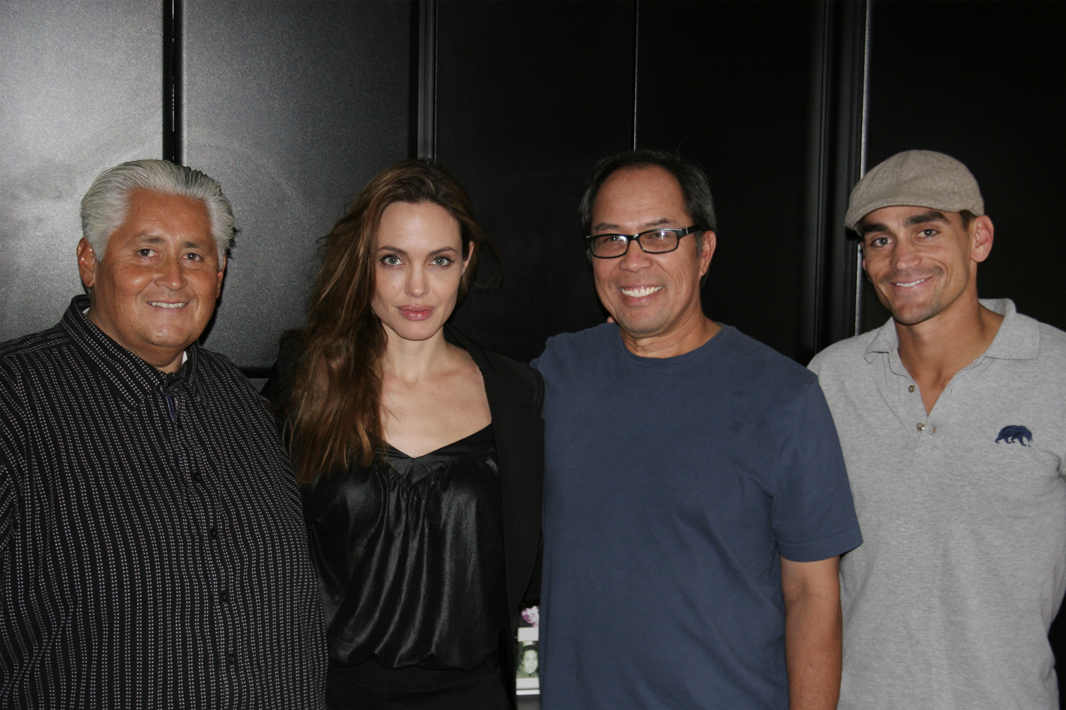
Building off their decades of experience Dan and Ramon built the team behind Bravo Design to value dedication, teamwork and a commitment to solving design and advertising problems creatively and thoroughly. Bravo has had the privilege of working on many high-profile projects in our 20 year history across the film, streaming and TV landscape.
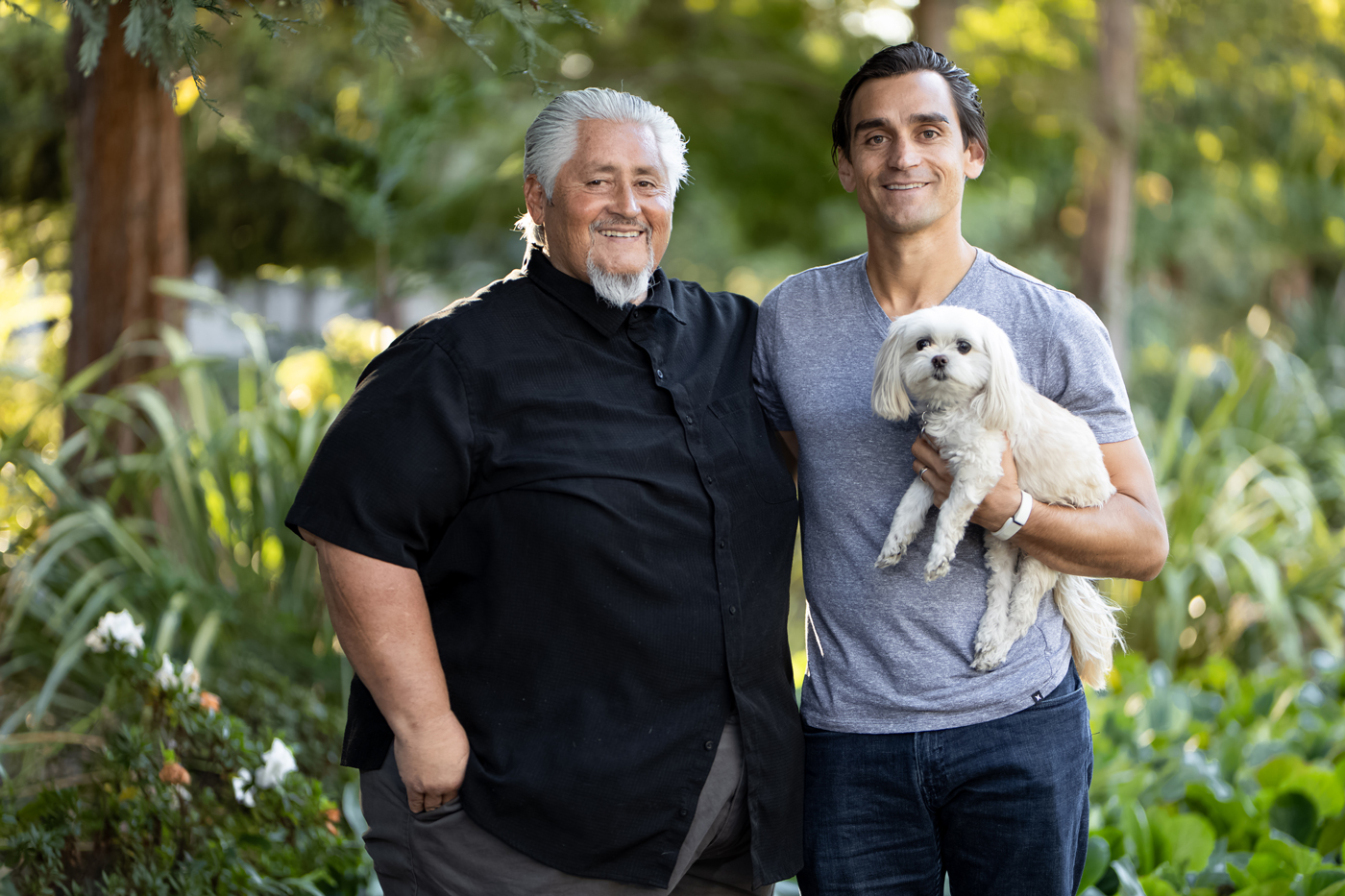
Dan’s youngest son Daniel joined the company out of college in 2006 and assumed Ramon’s ownership role when he retired in 2018 forming a father-son (and dog) owned business.
Contact
Bravo Design, Inc.
2809 W Magnolia Blvd Front,
Burbank, CA 91505
Office
(818) 563-1385
We are always looking for talented and experienced people to join the team!
Careers
careers@bravodesigninc.com
Upcoming project or campaign?